Showing posts with label Art. Show all posts

2022 September/October Art Dump

This year my co-blogger Breana got me to do Sha'an d'Anthes' (Furry Little Peach) Peachtober. I only took a few progress photos before finishing them. Some of them I almost forgot to take any at all.

I did have a digital Halloween painting that I started a little late. I'll post it when I'm happy with it. I'm really enjoying the process. Anyway, here are the photos. And you can find Breana's art here


Hello Again, Some Art and Art Block, New Old Books

I'm back from my break and wanted to catch up over here. 

I wanted to return earlier but that never happened. My art block kind of extended into everything. Before that I finished some art.


And sometimes it's nice to just sit there and create abstract things until they form something. That’s how I ended up with these two after feeling better.


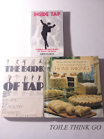
Not much of a haul person, but I did get some things. First up are the last books from two series I needed to complete, The Books of Elsewhere and Dead City. Then I got some books from Better World Books. I was mainly after the Old-Fashioned Baking by Better Homes and Gardens. Then I looked for tap dancing books. 

Three books arranged in a triangle position. Inside Tap by Anita Feldmand, The Book of Tap by Jerry Ames and Jim Siegelman, and Old-Fashioned Baking by Better Homes and Gardens.Books arranged in an upside down triangle. The Books of Elsewhere: The Strangers and Still Life by Jacqueline West; and Dead City: Dark Days by James Ponti


I have to admit, I love old books. That's why I jumped at The Book of Tap by Jerry Ames and Jim Siegelman. I’m already  reading Inside Tap and currently like it –especially that Feldman starts with defining the terms. But, I'm going to stop myself here because this isn't  a review.


Thanks for reading!

Kinda, Sort of Break / 2021 Art Dump

Hey, I usually take a break when Our Thoughts Precisely posts the break announcement, but I think I'll be away a little longer. I'll be around, but not posting (except for post that were prescheduled). Anyway, art dump in coming! Also, thanks for reading and enjoy your holidays.

Sweet Dream Afro

Spring Showers and Flowers | Mermaid Dress

Strawberry Girl + Adjusted version

Random Sketch | Sketch Inspired by Let Me Call You Sweetheart (Mary Higgins Clark)


My Favorite Looks from Valentino's FW21 Show


Halloween 2021 | Halloween Art on Our Thoughts Precisely Part 1 / Part 2

Holidays 2021 | Doodle About to Sit/Party Girl

End of the Year (EOY) Round Up 1 Melanie Main & Melanie Halloween
*(I'll post the other parts later. *Edit they're below.)

Strawberry Girl and (lack of) Mermaid Gown EOY 2

EOY Spring Showers and Flowers

You can catch my time-lapses over on AdriArting 

The Speedpaint: Arting Part 2

This is the second part in my Arting posts. Today I’m going to talk about what I painted on my first speedpaint. You can read Arting Part 1 HERE.

Shirt close up backShirt close up front

As I said in part 1, I wanted to start a Spring. I need a sort of logo and I had an idea of what I wanted. I ended up with a decent amount of sketches, but I settled one (I still want to illustrate the other ones). Since I settled on Sweet Dream Afro (that can be found here) there were many elements I wanted to include. First and foremost, I wanted to make fashion like piece. The hair had to be natural, so I went with loose twist outs. And finally I wanted a dream element, the sleeping kind by the way. In this case I opted for closed eyes and a dream journal. This is a personal touch because I have been keeping a dream journal since 2013. I may talk about how I got into dream journaling eventually.

Front view of the actual shirt, which is lighter.Front view of the actual shirt, which is lighter.
Spring mockup on a pink shirt

In previous iterations (and this one) I had trouble with the clothes. What color, shape; and a skirt or pants? Speaking of color, I originally imagined more pastel colors. However, I started considering darker options for the clothes when I decided to use a darker hair color. I settled on what you see now. I found other combinations I liked. So, similar to what I said above, I may do another piece with this same character. You can see the final art below, and how it came out from Spring above vs mock up. This is the first and last time I’m using that triangle as of right now. I have something else I'm designing.

All and all, the time was around 7+ hours. However, it may be way longer because the files for the sketching and line art got corrupted… Yay! 

[I'm re-editing this timelapse, it'll be back soon!]


Thanks for reading and watching. My YouTube is AdriArting.

Trying Something New (Arting Part 1)

I’ve been drawing much more recently. And I wanted to do a Teespring (now Spring). And then I realized that I never posted much of my art online. I settled on doing what I thought I’d never do –starting a YouTube. It was the last thing on my mind, but here I am. This is part 1 of Arting. I’m making it up as I go. Before I start, I think it should be said that I am not abandoning blogging. Nope, I’ll probably blog more about my adventures in art and my thought process. I’m also going to be adding a page as a sort of gallery; plus, I’m thinking of revamping my Instagram to include both my art and reviews. Today’s post is mostly rambling. The speedpaint will be in part 2.

I’m mainly doing digital speedpaints and it’ll be that way for a long time. I have always been drawing since I could remember. Watching art videos just came along naturally. Eventually, I got my Wacom Bamboo Fun, which was bundled with Corel Painter Essentials 4 and Photoshop Elements 8. That’s when I started watching digital speedpaints to try to learn the software. Also back then, I got Manga Studio Debut 4. (And you can imagine how mad young me was when I found out the cover art was done in Photoshop. I can’t recall, but I’m pretty sure Manga Studio itself had more abilities than Debut. Nonetheless, here’s a fun fact, Manga Studio is now Clip Studio Paint. Okay, back to the topic at hand.) Watching, re-watching, and editing my first video felt somewhat nostalgic to be honest. 

I had a couple of programs to get started. Like AMD Radeon ReLive to screen record and Blender to edit it. That combination was fun until I nearly killed my computer. Recording was constantly crashing my graphics card. I’m surprised I even got as many clips as I did. Especially since the files for the sketching and line art got corrupted. I’m really disappointed because I was happy with them too. I sped everything up in Blender from 7+ hours to 6 minutes. Now, to be fair, Blender is more for modeling and other things, not video editing. But my rendering time ended up being around 4 hours. I let that go over night, but I knew it was too much. So, I then tried to use Kdenlive. I love the layout and user interface a lot. But it wasn’t what I needed. I chopped up the second video I’m worked by a lot. As it turns out, you can’t CTRL + A (select all) and speed up clips nor connect them to do so. To have to manually select each clip to apply speed changes was not efficient. 

I tried so many open source programs. I’m currently taking a chance with Olive 0.1 since it's unsupported. I can’t merge clips, but the speed can be adjusted all at once. I still have to manually slide clips back together, but the render time wasn't too bad. About an hour for 23 minutes Back to the first video, I took the already rendered video and added the final image in Kdenlive. This ended up rendering in 36 minutes. I can’t wait to post it. Anyway, rambling over. Thanks for reading.

Artist’s Loft Necessities Acrylic Review

10 small tubes of Artist's Loft Necessities Acrylic laid on top of the gift set case
Today, I'm reviewing the Acrylic that came out of the 126 Gift Art Set by Artist’s Loft Necessities. (There are only ten tubes in the case. Unlike the set of 12, it doesn’t come with yellow ochre and raw umber).

I received the set in 2019. Over time, I have slowly used various things out of it. It wasn’t until recently that I used the acrylic. While my mom was trying to paint a glass ornament, I was trying it out on the paper that came with it. I immediately noticed how thin and transparent it brushed on. The paint dried horribly on the ornament and she ended up coving it with some of the other acrylics we have. Somehow, I managed to get something decent with my first painting (not pictured). Despite my first impression I wanted to try again. The next two painting are on Artist’s Loft Watercolor Pad (you can find that here). 

3/4 head after I painted over with other acrylics
After I painted over with
other acrylics
3/4 head original with Artist's Loft
Original with Artist's Loft
The first thing I dislike is that these don’t act like any acrylic I’m used to using. As I said above, it’s transparent. And no matter how much paint I picked up on the brush, it always painted thin. I even tried using a damp brush. On my second painting, it streaked badly (left). It became streakier when I tried to build up color. I even let it dry some before applying more color. Still, more streaks. I gave up and lazily filled in the hair. I wasn’t finishing it with these paints anyway.

Two models

Almost 3/4 head

Not everything was bad. With the next paintings, I changed the way I thought about the paints. Maybe like… a watercolor-acrylic? I started adding a lot of water to them, more than I would to reactivate watercolor. Additionally, I cut down on how many colors I mixed to get my skin tone from four to two. (Honestly, I have no idea if this really affected its performance. But, it did save on paint.)  

I was able to layer the paint a bit better with it watered down. I also controlled the streaking some by doing the wet on wet technique. Despite being hard to layer and my gripe with streakiness, this turned out to be fine for how I paint hair. So that’s somewhat a plus. 

For an attempt at fair comparison I did one more painting. The left side is Liquitex Basics. I used quinacridone magenta and titanium white. The right is Artist’s Loft Necessities. I used crimson red and titanium white. I did this for texture and opacity rather than color.

At the top of the paper is a thick and diluted swatch. I messed up the first swatch (top) for the Artist’s Loft because I accidently added more paint when I was trying to only do one swipe. So I did a smaller one under it. I went back to the paper that came with the set and it is more textured. I’m not sure exactly what type of paper it is. In the end, the Artist loft acrylic fared better but I still like Liquitex Basics (seems creamier). However, I enjoyed using it more on this paper. I struggled less with layering and getting some opacity. 

Pink and red mannequin upper close-up
Pink and red mannequin fullPink and red mannequin lower close-up


Overall, it was difficult to work with and didn’t behave how I expected it to.  Especially on smooth paper, glass, or primed canvas. But, still, I don’t think this is the worst paint ever. It would have ended up with a 2 1/2 if it wasn’t for me using heavily textured or porous surfaces –like salt dough and cold porcelain (a topic for another post). Who knows, maybe you’ll like it more than I did. 

My Pros and Cons

Pro

  • Doesn’t dry fast when thick on the pallet
  • Dries somewhat quick on paper
  • Fine if you don’t mind thin paint

Neutral

  • I somewhat like it for painting hair
  • Works fine on heavily textured or porous surfaces

Cons

  • Transparent and thin
  • Hard to layer, and sometimes waiting until mostly dry to get some layering
  • Streaks easily
  • Overall difficult to work with
  • Small tubes


Thanks for reading.

Book Review: Color Index XL

Title: Color Index XL
Author: Jim Krause (about)

Source/Format: Blogging for Books; Paperback
More Details: Art, Reference
Publisher/ Release date: Watsin-Guptill; October 3, 2017


Goodreads     Barnes & Noble     Penguin Random House     Amazon

Synopsis from Penguin Random House:
This updated, expanded, and oversized inspirational resource presents 1,100 color palettes, with light, bright, dark, and muted varieties for each one, making it the most expansive palette selection tool available.

Color Index XL provides aspiring designers, artists, and creative individuals working with color with an indispensable, one-stop method for reviewing and selecting current, up-to-date color palettes for their creative projects. Designer and lecturer Jim Krause’s classic resource is back with a new approach that presents each group of palettes in an oversized form for easy visual review, and bleeding to the edge of the page (edge indexing) for quick access. By providing variations for each palette, Krause ensures that creatives can find the best color selection for each project’s needs. This book serves as the perfect resource for teachers, students, and professionals of all kinds in the art and design space who want to stay up-to-date on the ever-evolving trends in color.


My Thoughts:

Jim Krause’s Color Index XL is just one of those books that you’ll want to have next to you when you start any project that requires color cordination. There are so many colors that the possibilities seem endless. With a mini introduction to color theory, which goes over hue, shades, and picking cohesive colors, this is definitely a reference book to checkout.

The first thing I love about this book is that at the beginning of the three chapters the total number of schemes is stated along with the temperature. Each color is presented with other colors in a select pattern, which is nice, especially for inspiration. Finally, I love that each scheme is represented in four different variations of bright, light, dark and muted. This just expands color picking options.

Overall, I recommend Color Index XL if you work with CMYK and RGB values, or even if your simply searching for color inspiration.


I received this book from Blogging for Books for this review